Infura Interface Overhaul & Design System refactor
-
Timeline:
8 Months
-
Year:
2022-2023
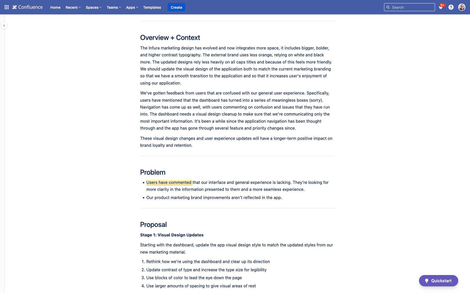
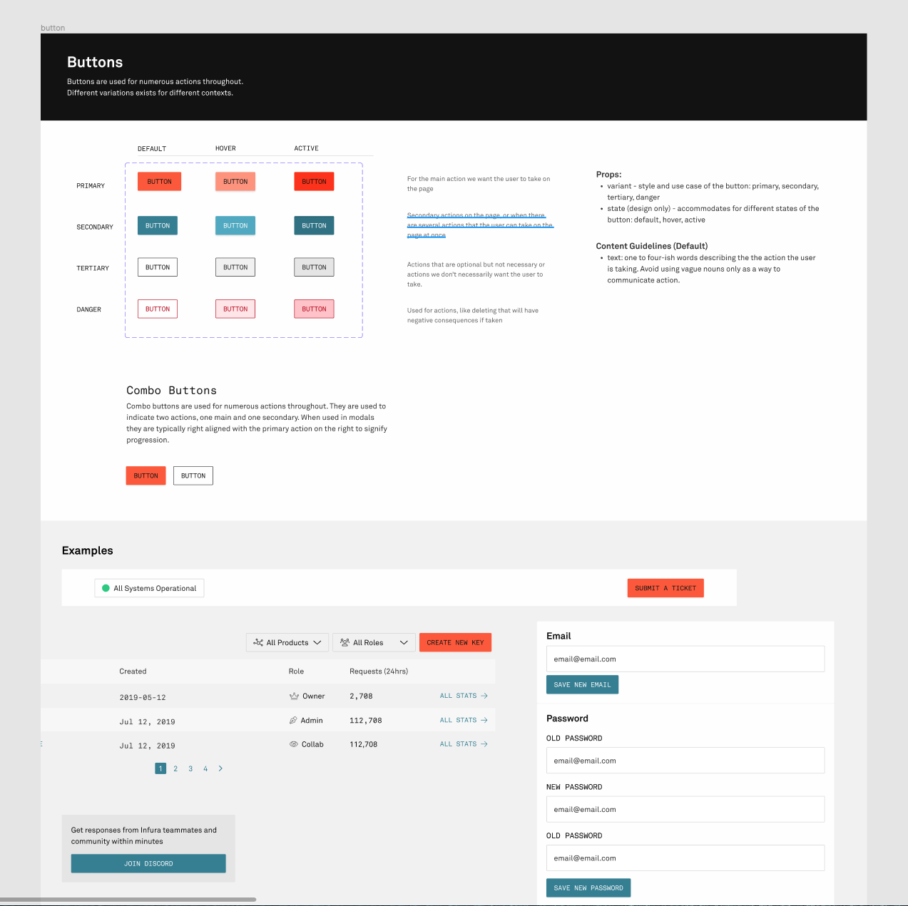
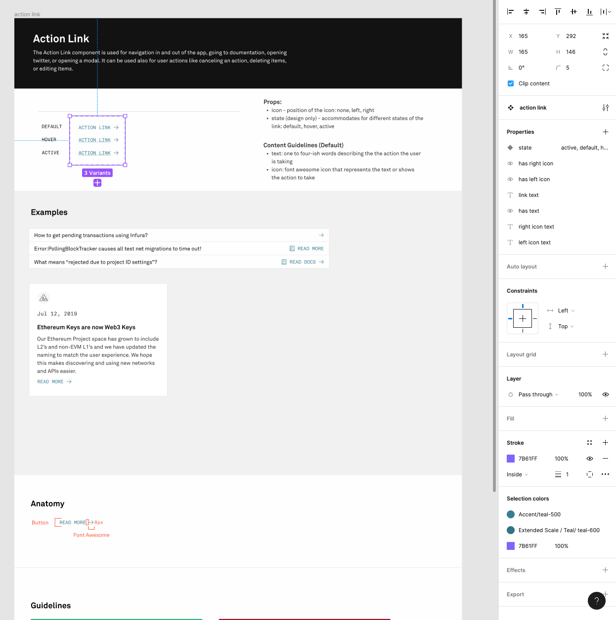
The Infura team kept getting user input that the design and user experience were disjointed and not up to customers' standards let alone as quality as competitors. The visual design had grown stale and constant feature additions led to a haphazard component system. The components themselves weren't used consistently both in design and code. There were a lot of one-off components that were used in just one spot. There were 10+ types of buttons being used across the app. This created a system where the design and development of new features were taking longer than they needed to. It created a lot of duplicated designs and code.
I got the project started by digesting feedback from users that our support staff and product teams had already collected. Using that information, I wrote up a product proposal outlining issues with the current user experience and goals for a project to tackle those problems. Our goal with success metrics was to make them as tangible as possible so that it would be clear that the effort to rebuild the design system infrastructure was worth the time we were going to put into it. Some of those success metrics were:
- Time to ship from design to production faster
- Increase consistency across the application and have fewer components to maintain
- Have a direct impact on retention, with no users commenting about the interface as a reason they're churning
I started with visual experimentation across all of the core pages of the app. I used the newer brand design work as a starting point for the styles. Once I felt like early iterations were heading in a strong direction, I started to collect feedback from the brand design team and the design director. After refinements from that early feedback, I opened up the designs to broader feedback from the full design and web development teams.
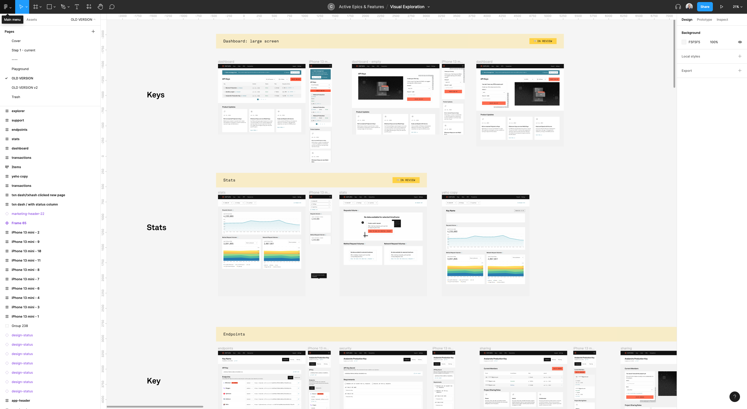
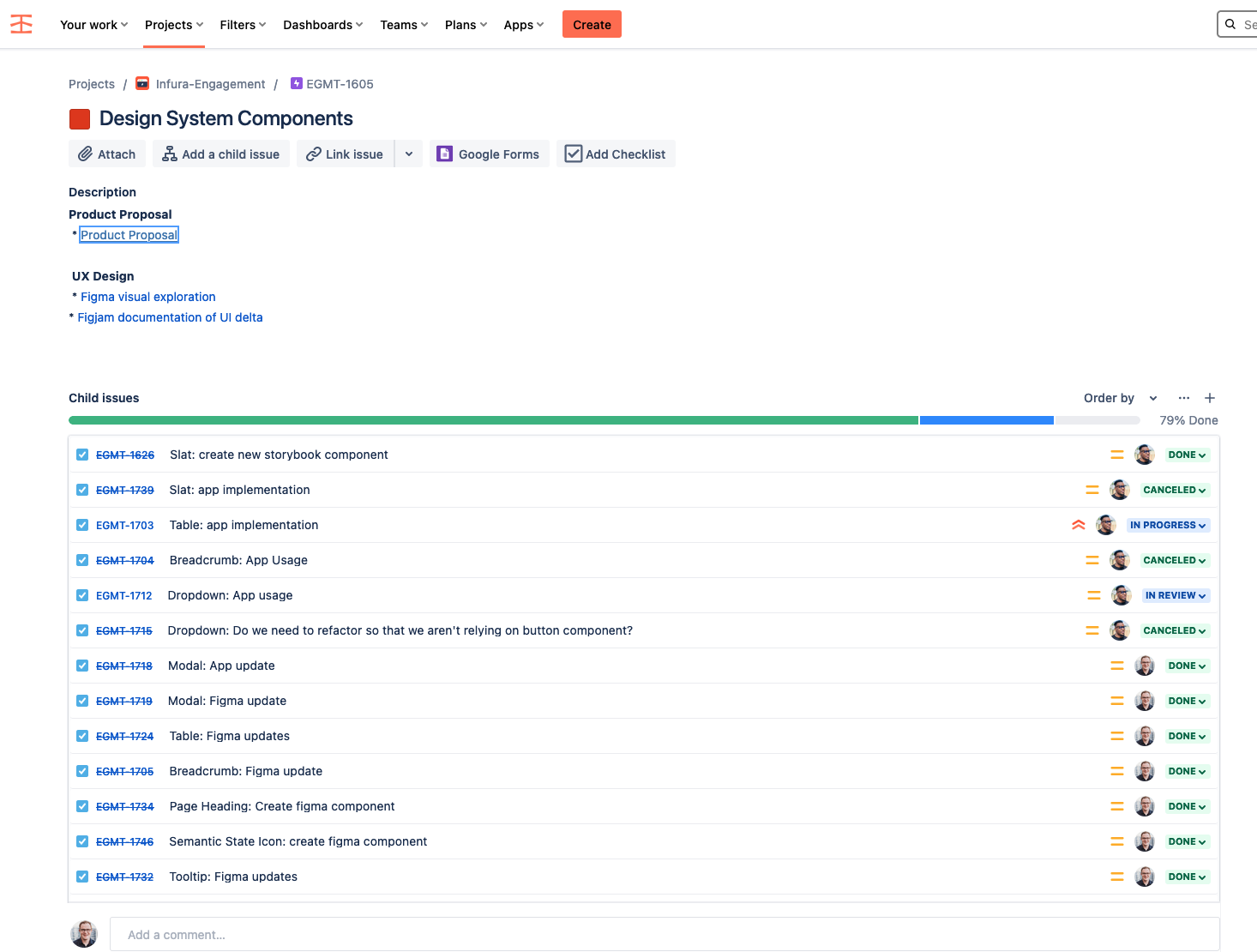
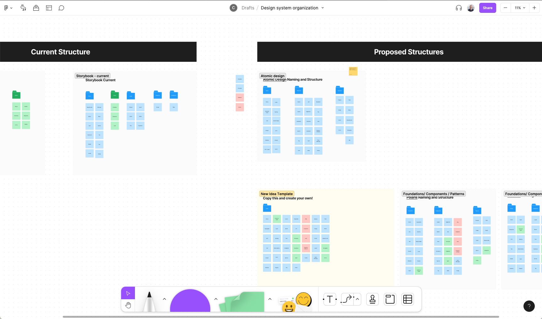
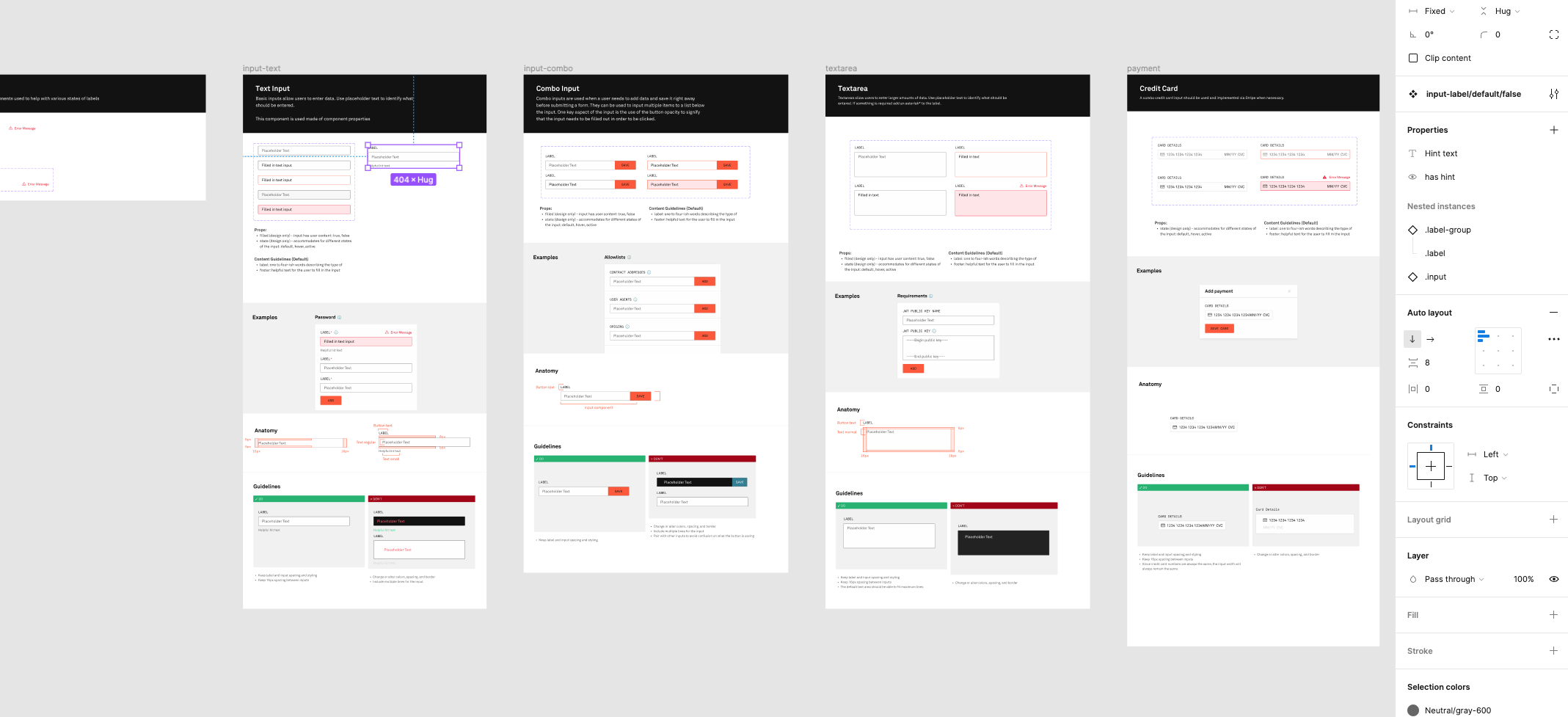
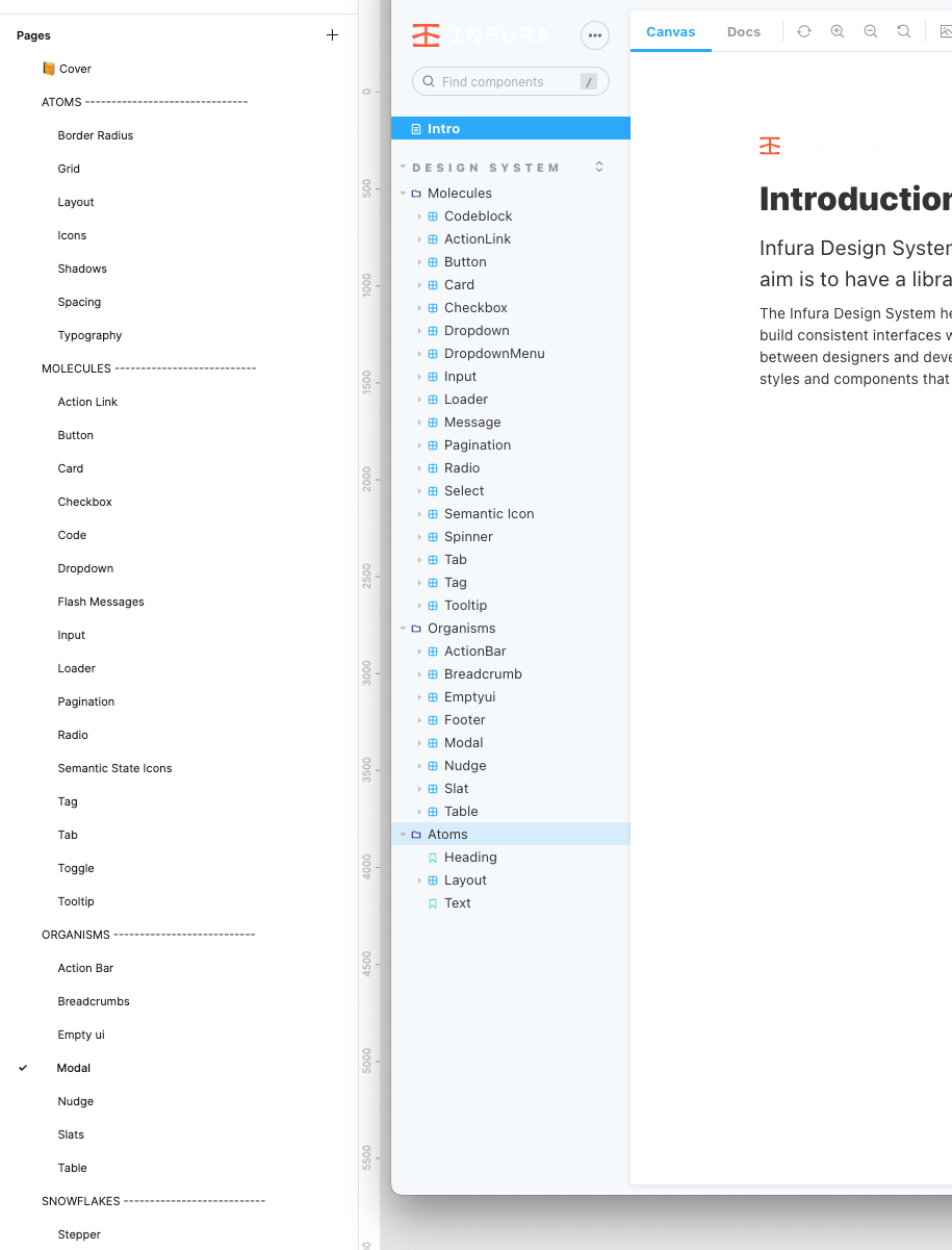
With everyone onboard, I broke out the exploration into core components that I knew the application needed. I synced that with the existing component library. I also ran through the interface and did an inventory of the number of components that we would need to make sure that there weren't gaps in need with my visual experimentation. With all this documentation I planned out what the finished component library could look like using Atomic Design language.
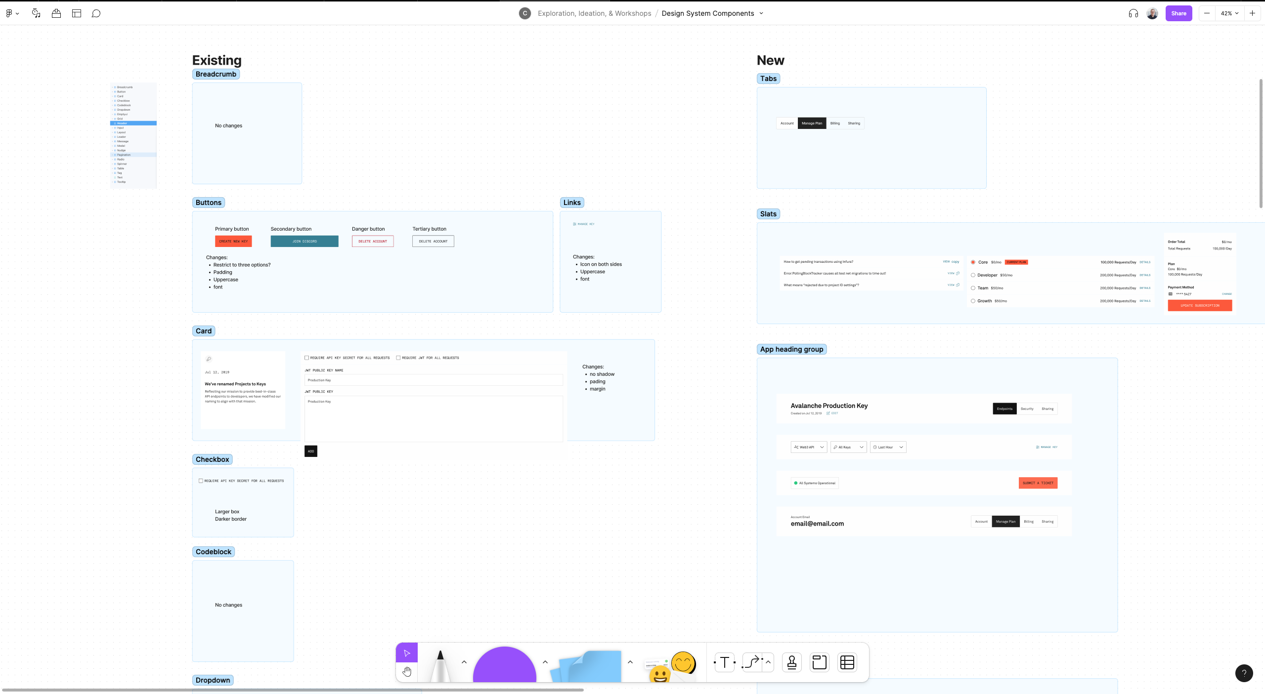
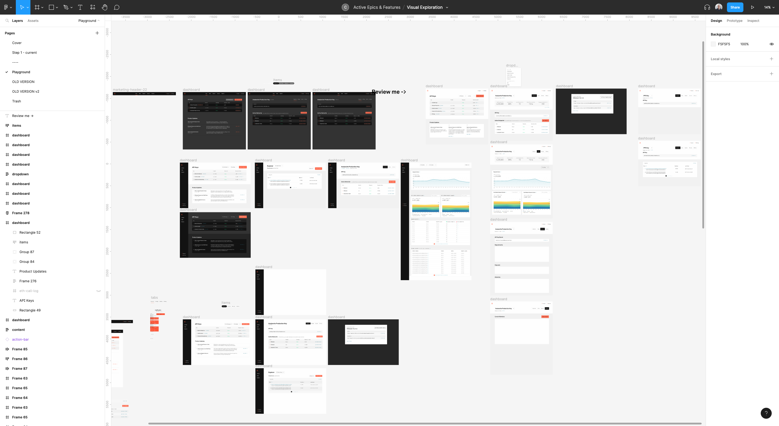
Working one component at a time, I would update Figma, then dig into React Storybook, then use that component throughout the app. Each step would inform the next, but as we discovered different use cases and needs while implementing, we went back to the Figma and Storybook components to update them. Because I was acting as project manager for the updates to the Design System, it was easy for me to identify where gaps were in any of the stages of the component's lifecycle and address them.
We rolled out each new component as we finished it rather than waiting till all of the components were done. With each component refactored and implemented in the app the interface slowly took shape into the visual exploration that I had started on months earlier but since we shipped it in small pieces no users ever saw a drastic change in design.
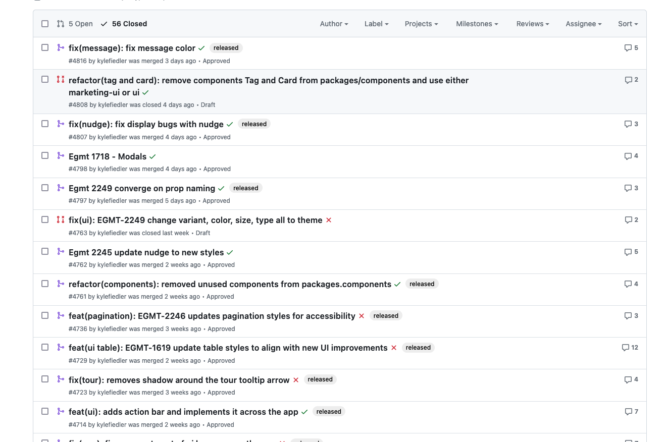
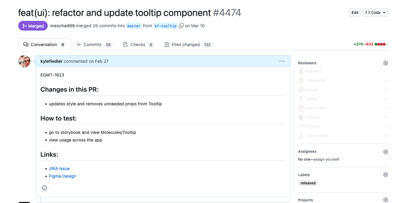
While implementing each component, we would also tackle small UI or UX bugs that had cropped up over time when developers were trying to ship as quickly as they could. Not only did this refactoring help the user experience, but it also helped clarify which components to use.