Integrating a core business offering into the mobile application for Point Health
-
Timeline:
8 Weeks
-
Year:
2021
-
Role:
Product Design
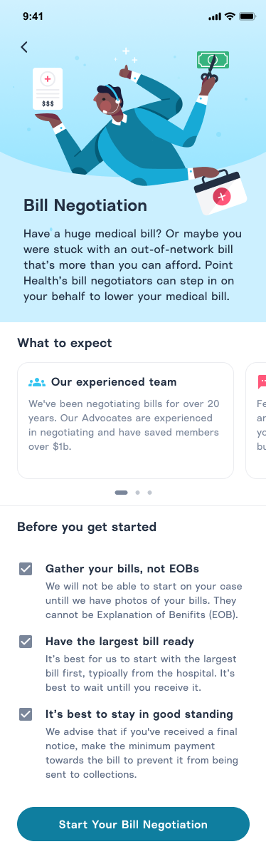
One of Point Health's core business offerings is negotiating high medical bills down for its members. Currently, the whole process is done through phone calls and one-off emails, with our Patient Advocates each being their own project manager to stay on top of the status of each of their cases. We saw an opportunity to bring this offering to the mobile app to increase the volume of people that we would be able to help and support the Advocates in managing their caseload.
Start by understanding the current processes around Bill Negotiation
Before I started doing any design, I wanted to get a better idea of the current process for intaking new bill negotiation cases and the work involved in the negotiation. I spent half-day for a few weeks listening to the work that our Patient Advocate team was doing. The team was incredibly accomodating to me to listen to the calls they were on and follow the work they were doing. Watching several of our Advocates work established a base understanding of the process. More importantly, it gave me a sense of how the member was feeling and what the teammates were feeling through the process.
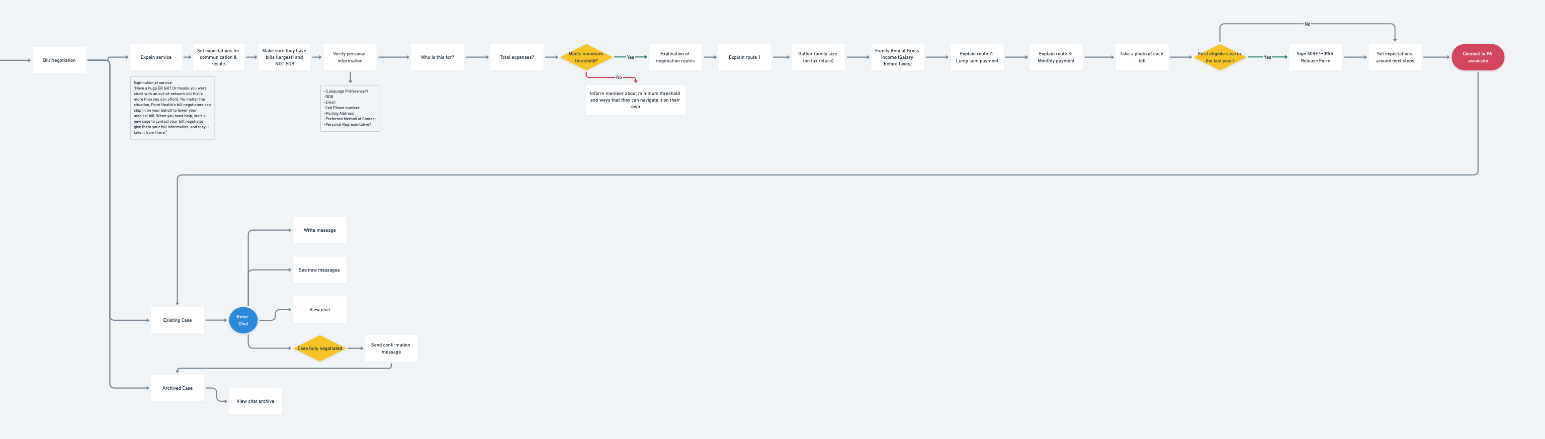
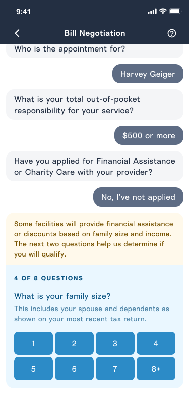
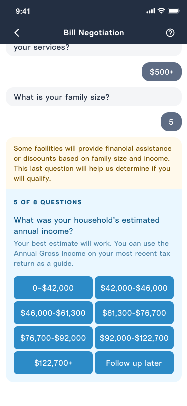
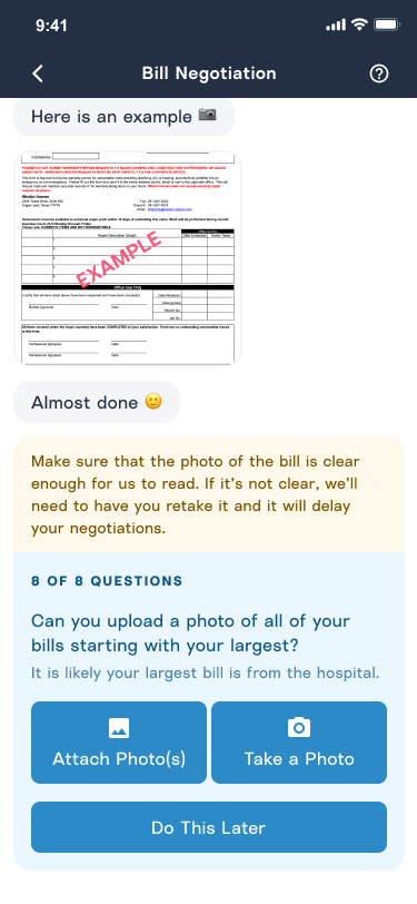
Mapping out the interactions and collecting the needed information
Using Whimsical, I began to map out the flow of the information collected on the phone call and evaluate whether it made sense to keep those questions in the app. Along the way, I gathered feedback from our Chief Product Officer, another Designer, and the Patient Advocates themselves. With this information, I felt like we could start designing flows for what the potential user interaction would be. Once I felt like the flow was in a good spot, we reviewed it as a team during one of our Product Strategy Meetings.
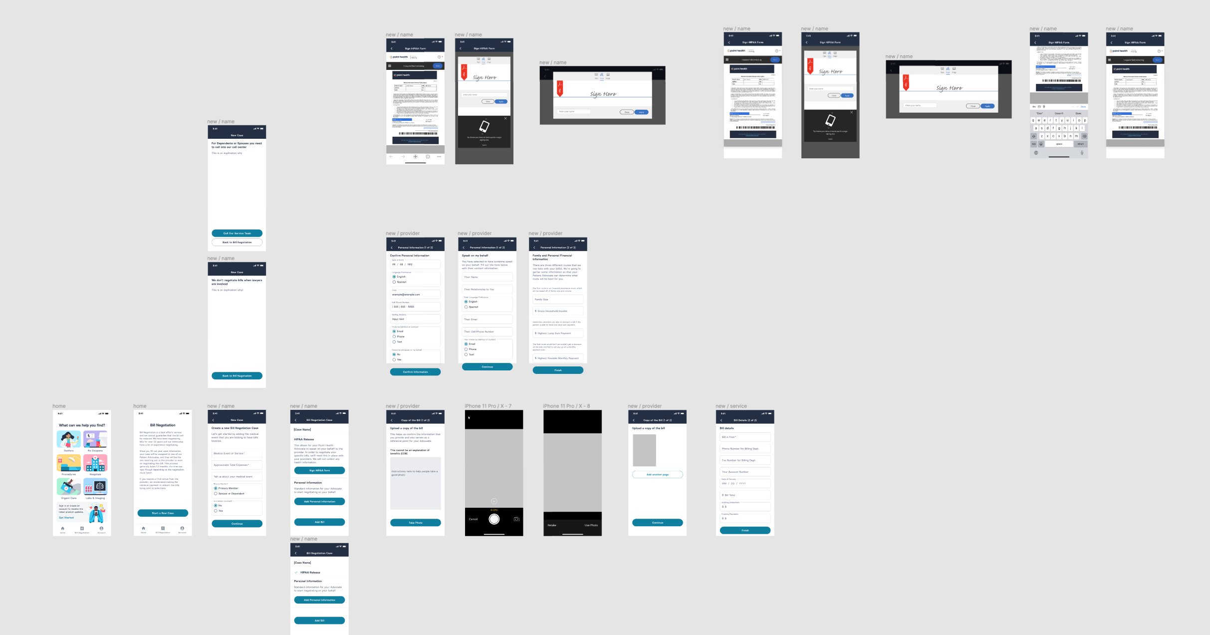
Initial prototype
With the user journey mapped out, I was ready to start prototyping what this might look like in the app. During the Product Strategy Meeting, I was asked to make the first version as minimal effort as possible so we could start seeing the impact this might have on members and the Advocates.
With this in mind, I thought that the biggest opportunity to support the Advocates was to help them with onboarding new cases, which they saw as tedious and repetitive. I started to figure out how it would be easiest to collect all of the information in the app so that our Advocates could hit the ground running with a member on their case. Because of that, I ignored the negotiation processes after the member had been onboarded to minimize the project's scope. After being onboarded, the Advocate would continue to rely on phone calls to continue to update the member about the status of their negotiation. Again I continually collected feedback from the team and brought this prototype to our Product Strategy Meeting.
Messaging prototype
After seeing the prototype, key stakeholders saw an opportunity to increase member retention by retaining the member in the app instead of having them call into the call center. Because of the technical complexity, I worked closely with our Front-End Developer to investigate the best way to start on a messaging interface. They took a quick look at a few different third-party systems that would allow us to get the messaging app quickly. Based on the options we found, the team chose Stream. It fit all of the core use cases and features that we assumed we needed to get the first version done. Using Stream UI Kit, I quickly arrived at a new prototype for stakeholders to align on the business value of this approach. The engineers also used that prototype to get a sense of effort.
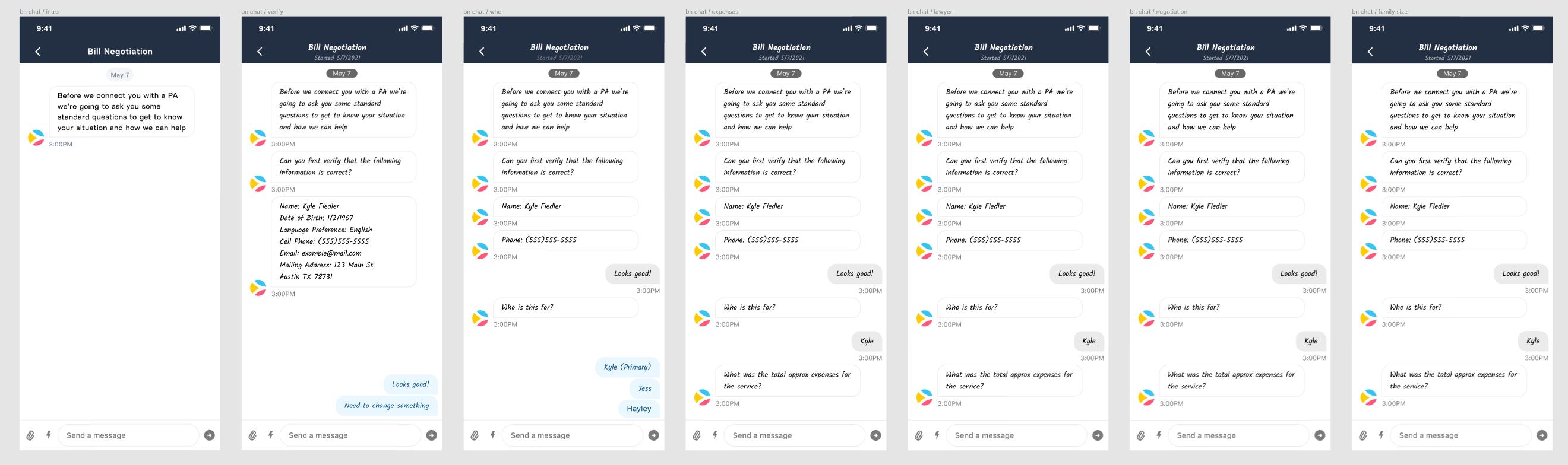
Refined messaging interface and onboarding
With an initial prototype for the messaging interface in a good place, we noticed we were relying on standard questions with a set number of responses. The engineers and I saw an opportunity to build a better experience without additional effort.
We ran this prototype through with our navigation team and got feedback from them. And we ran the prototype through testers to see from an outside point of you how the flow worked.
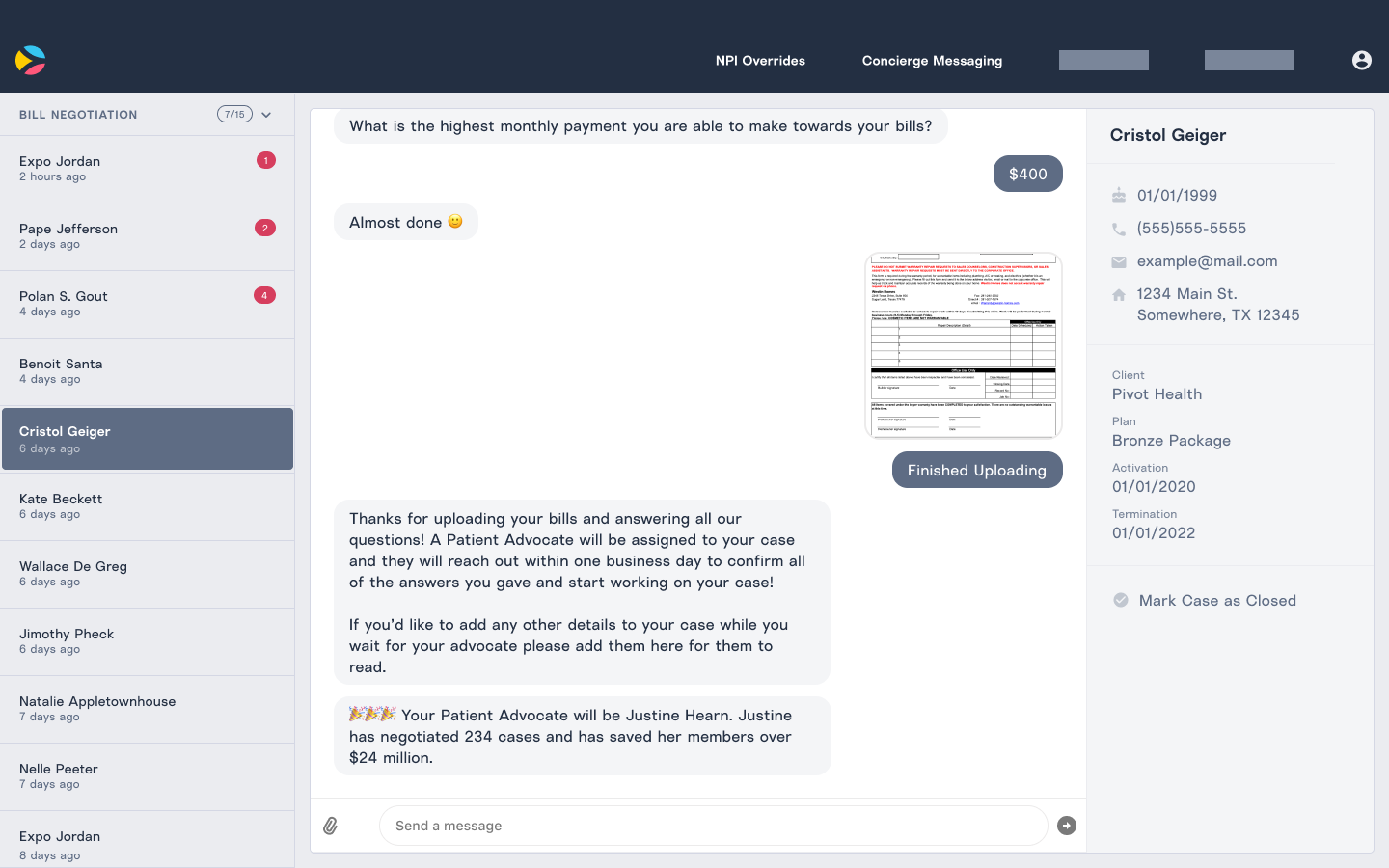
The Advocates messaging interface
Once we had a foundation for the members' interface and flow, we wanted to design a prototype for our Advocates to respond. This interface would need to allow them to view all of their existing cases, get back to their members quickly, and easily navigate different messaging cases.