Infura Interface Overhaul & Design System refactor
Timeline
Infura
Timeline
Role
Team
- David Atada — UX Engineer
Leadership
- Andrew Cohen — Design Director
- Tony Chen — Chief Product Officer
- Thom Allen — Development Lead
What is Infura?
A set of APIs and tools for developers to interact with the blockchain. Think of it as an AWS but specific for blockchain and crypto technologies.
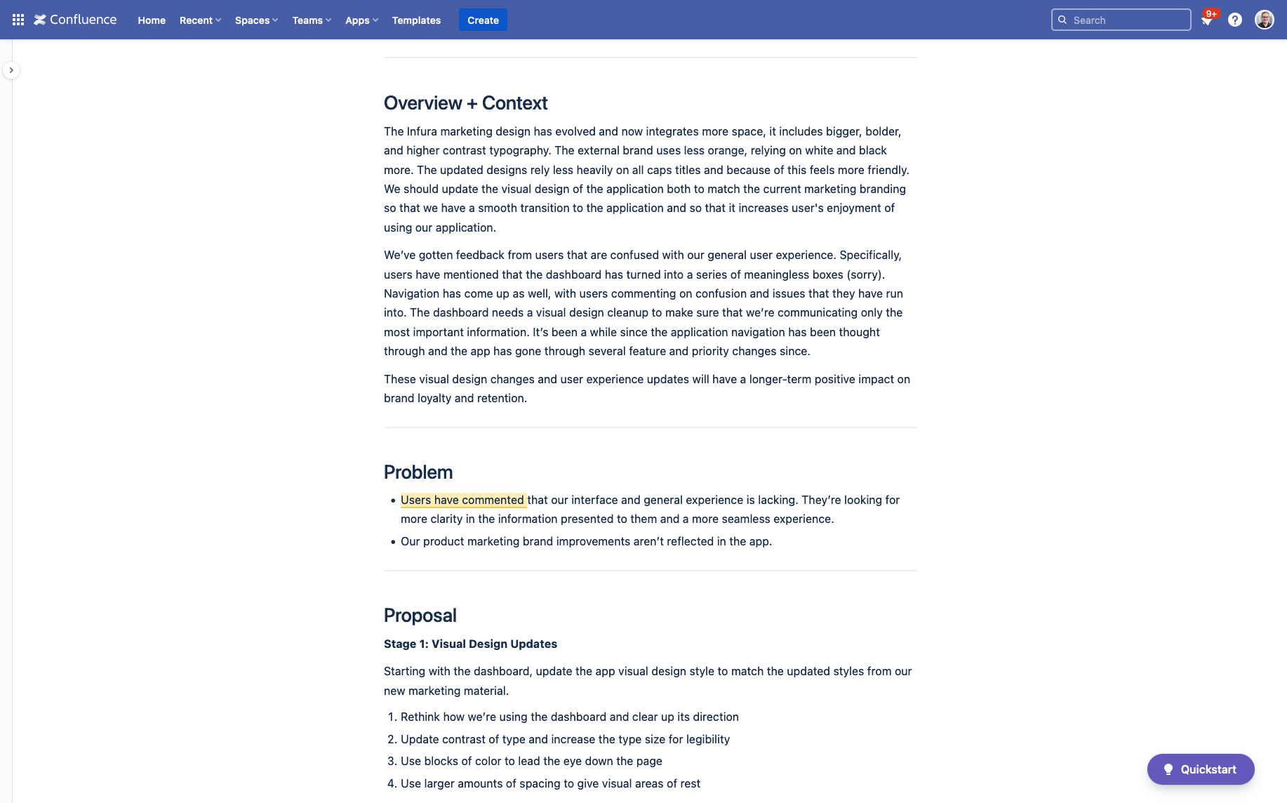
Infura’s design had fallen behind user expectations—and competitors. We regularly heard feedback from users that the UI felt disjointed, dated, and inconsistent. Years of fast-paced feature work had created a tangled component system.
How might we consolidate, pay down debt, and update the Infura UI?
Define the problem, set the stage for rethinking UI
I kicked off the project by reviewing feedback already collected by our support and product teams. Using this, I wrote a product proposal outlining key problems and a plan to tackle them, with clear, tangible success metrics:
- Reduce time from design to production
- Increase design consistency and reduce the number of components to maintain
- Improve user satisfaction and retention—eliminate UI as a reason for churn
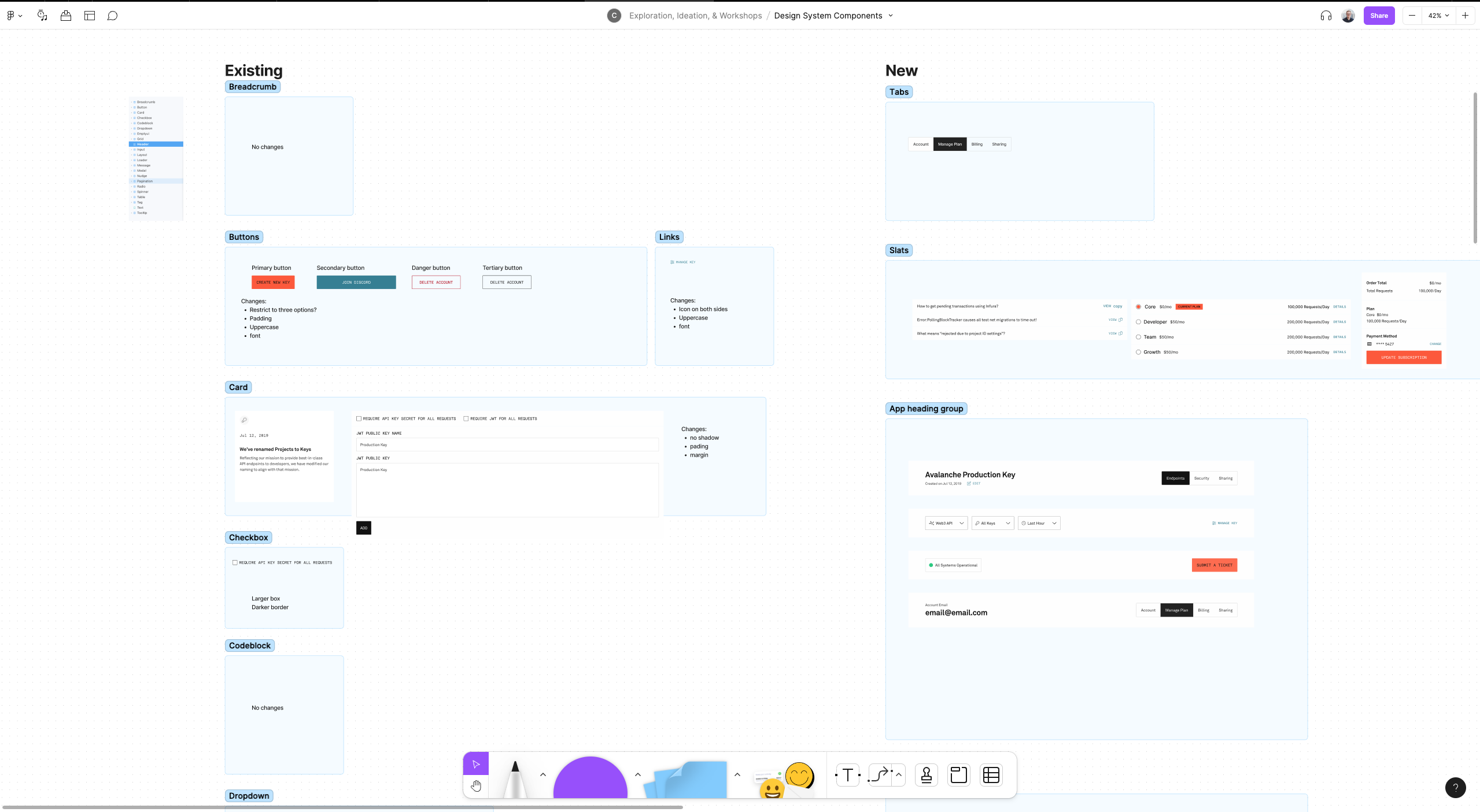
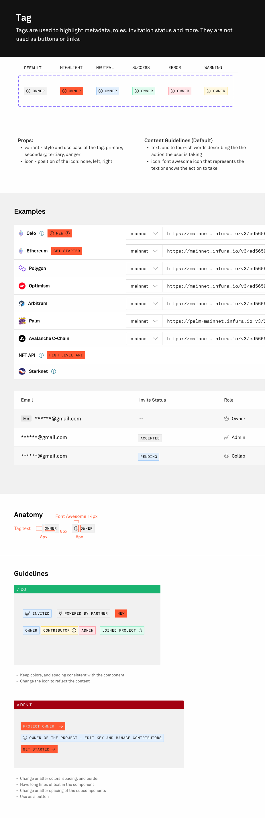
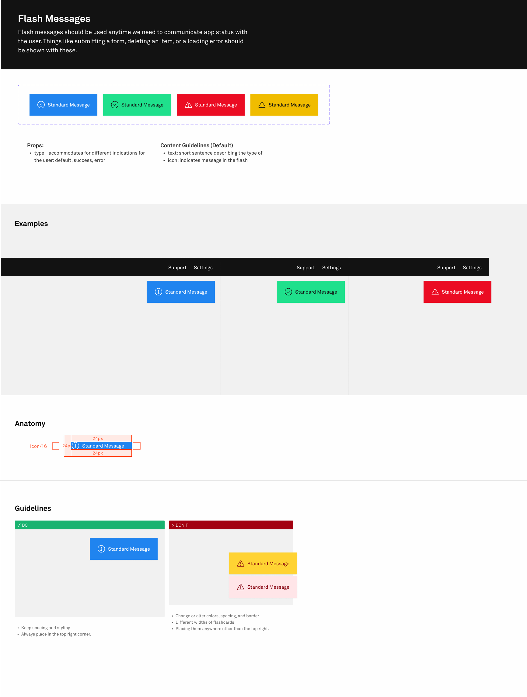
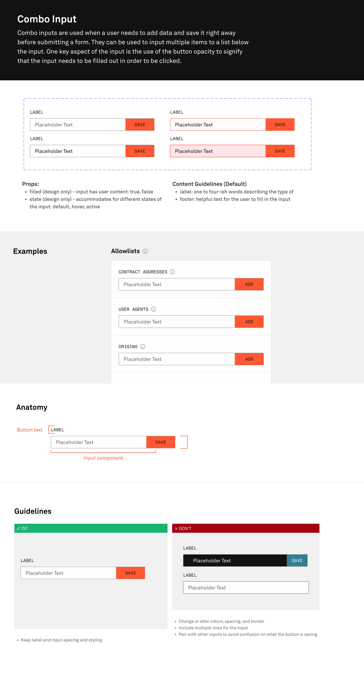
Conduct inventory of existing components
Once we had early alignment on the product proposal, I took inventory of the full interface and mapped components to real usage across the product. I organized this work using Atomic Design principles, to help guide structure and communication.
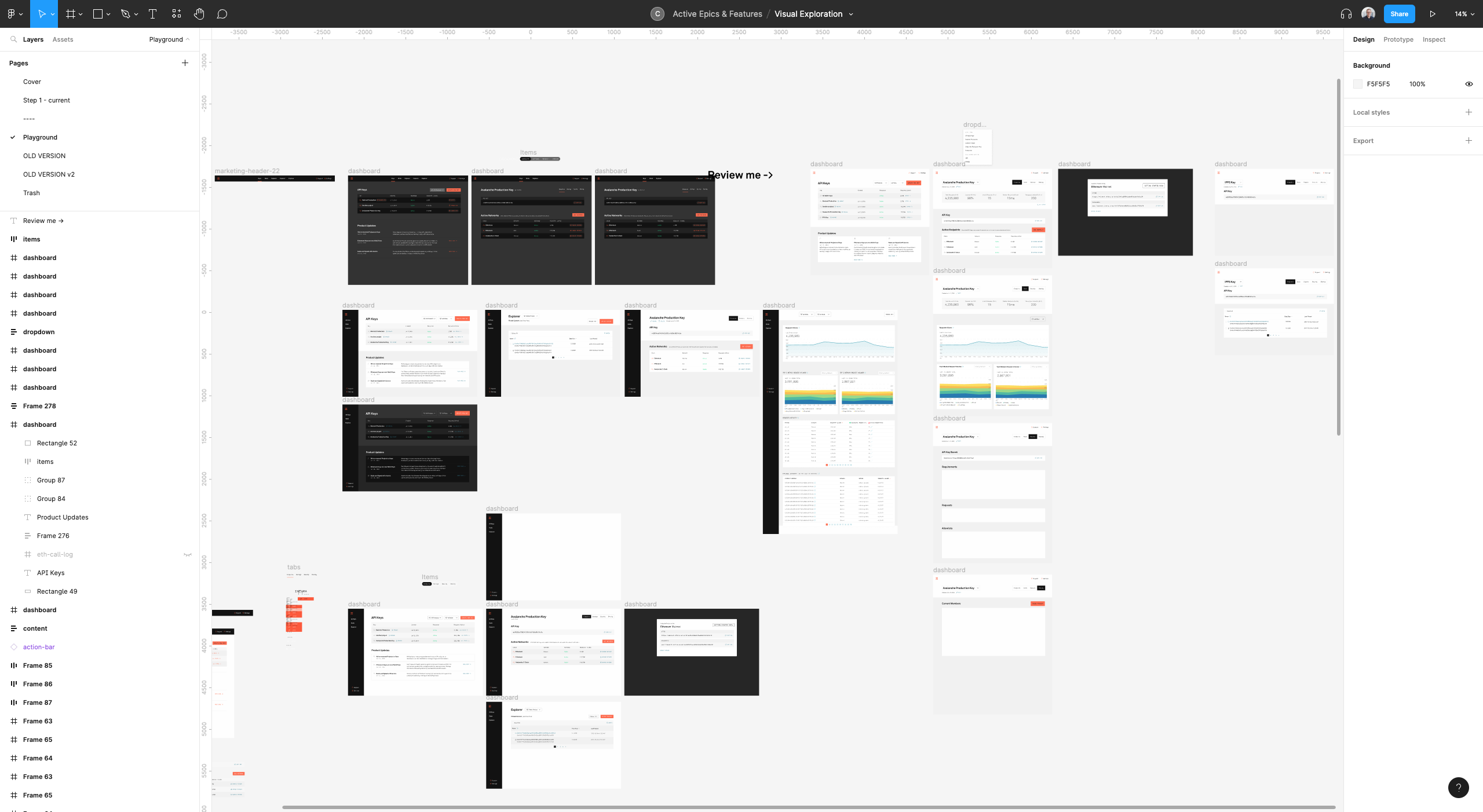
Visual exploration
Using recent brand design work as a starting point I began exploring updated visual styles for Infura’s core screens. After refining with feedback from the brand team and design leadership, I opened the work to broader input from the design and frontend teams.
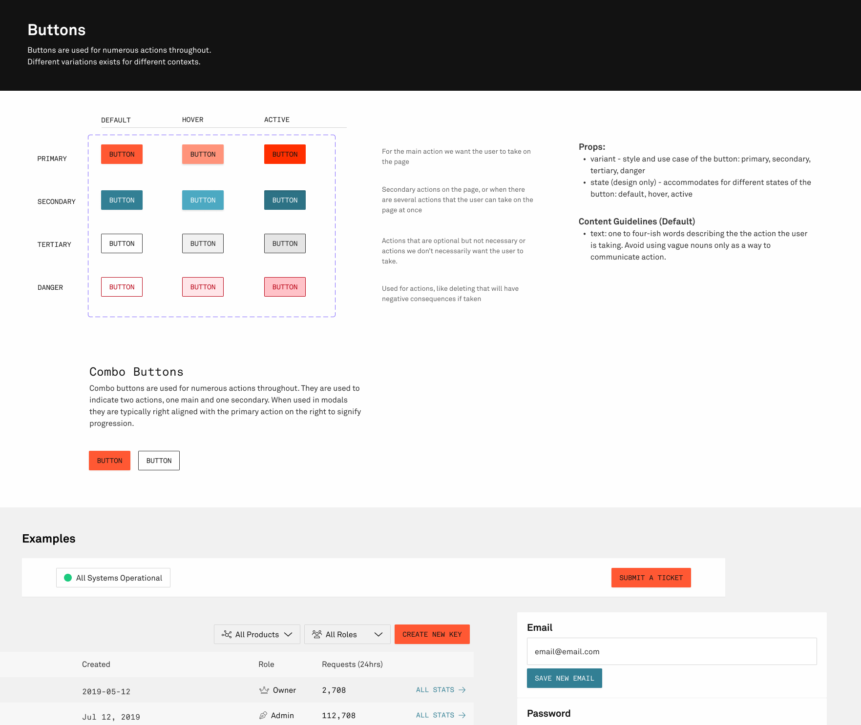
Rebuilding the system, one component at a time
For each component, I followed a full design-to-implementation lifecycle:
- Update the design in Figma
- Implement in React Storybook
- Integrate into the app
Each step informed the others. As new edge cases emerged during integration, I revisited and refined components in Figma and Storybook. Since I was also managing the project, I had visibility into where gaps were forming—and could quickly resolve them across design and engineering.
Shipping in iteration, not all at once
Rather than waiting for a big relaunch, we shipped components as they were completed. This meant users experienced a gradual improvement over time, never seeing a jarring change. It gave the team time to adapt to new patterns organically.
We also used each rollout as a chance to fix small UI/UX bugs that had accumulated. This not only improved the experience but clarified which components should be used where, reducing future inconsistencies.
Results & Impact
This wasn’t just a visual refresh, it rebuilt the foundation for how we shipped product at Infura. The end result: a cleaner, more unified user experience that scaled with our team and our users.
56%
Component count
53
UI bug tickets cleared