Conducting an interface inventory and establishing a core component library for Point Health's Design System
-
Timeline:
4 Weeks
-
Year:
2021
-
Role:
Product Design
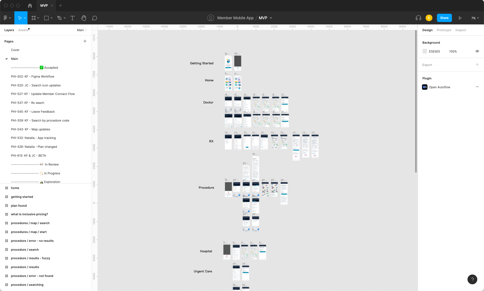
When I joined Point Health, one of the first projects I was assigned was to pick up where the previous designer had left off updating a design library. Before I started, I wanted to understand what had already been designed, what had been built, and where the potential gaps were between Figma and the app. I started by taking screenshots of each screen on the app and mapping out all the existing flows in Figma. Since I was still new to the product, it was an excellent opportunity to learn about the product while gaining a fuller understanding of where conflicts might lye.
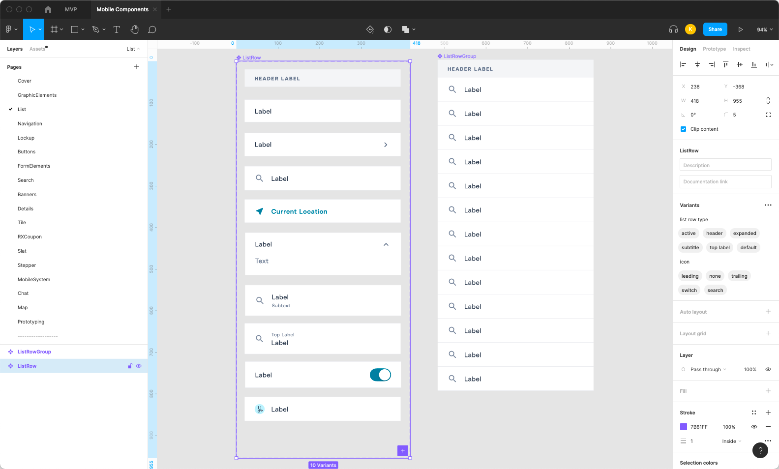
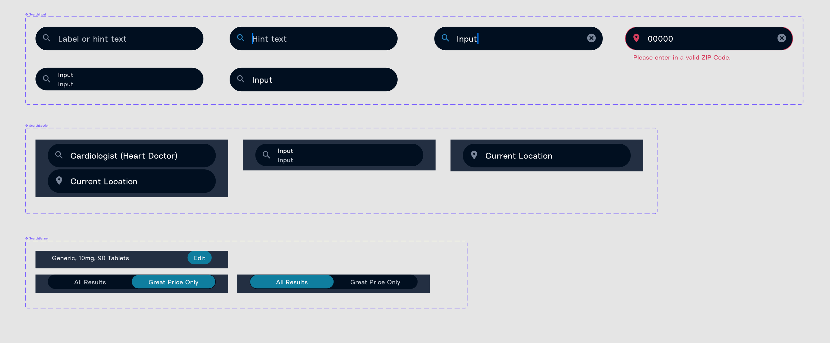
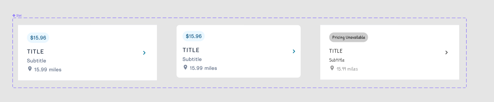
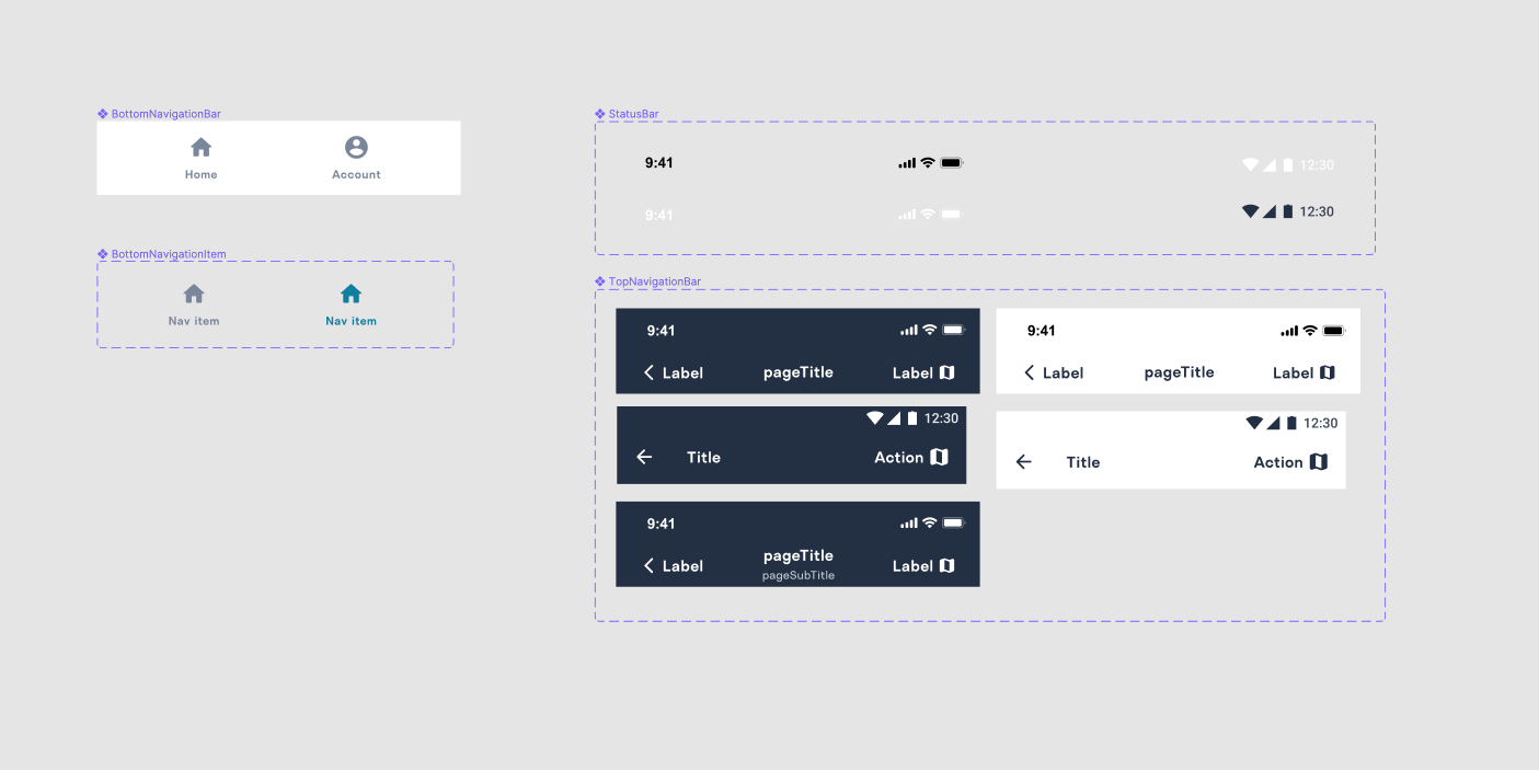
Taking inventory of common components
Once I captured all of the screens in the core flows, I started to figure out the standard components and patterns. I grouped screens and collected the common patterns that needed a single design throughout each flow. At first, this seemed like it would be an easier task, but as I dug into each design, I started noticing minor inconsistencies throughout each component.
- A 4px border when it should have been 1px.
- One heading that was title case and another that was all caps and another that was sentence case
- Small inconsistencies in spacing. Incrementing incoherently from 4px, 5px, 6px, 8px, 21px, 22px, to 24px
- Inconsistent ordering of information for similar pieces of content in the interface
Review the current state of the Figma Design System and file organization and implement
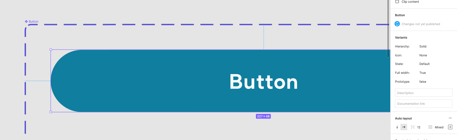
I started recreating pages to get a more intimate knowledge of them and see the gaps in the existing component libraries. Once I had outlined all of the current interface elements, I researched how other companies have organized their file system with multiple designers working on various features all at once. I wanted to take the time to set things up for Point Health to make it easy enough for non-designers to build interfaces. I understood Point Health's needs and how some of the best companies have built out their Figma design system. My next goal was to move all of the components into the design system Library. Then, have the application mockups reuse those components on a Main page inside the current sprints file.
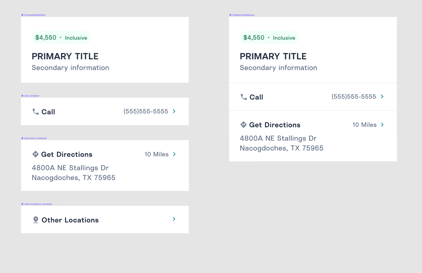
I converged all of the similar components into one component, doing my best not to wholesale rework components to reduce the effort for the front-end team. As I moved these components into an external component library, I replaced the old designs with the new main component. I methodically made my way through all of the main screens to get the Main page to be built of select components from the component library.
Continued iteration and growth
With a small design team, it has been relatively easy to keep this library up to date. Once designs are accepted by the product team and slated for development, we make sure that we update the designs on the Main page in Figma and the Mobile Components file in our Design System. Since the first iteration of this work was completed, we've changed several components and added several more. The simplicity of the components has allowed Project Managers to contribute quick prototypes and ideate along with the Designers.