Overcoming problems with NPI data and presenting the users with the most accurate information with Point Health
-
Timeline:
4 Weeks
-
Year:
2021
-
Role:
Product Design
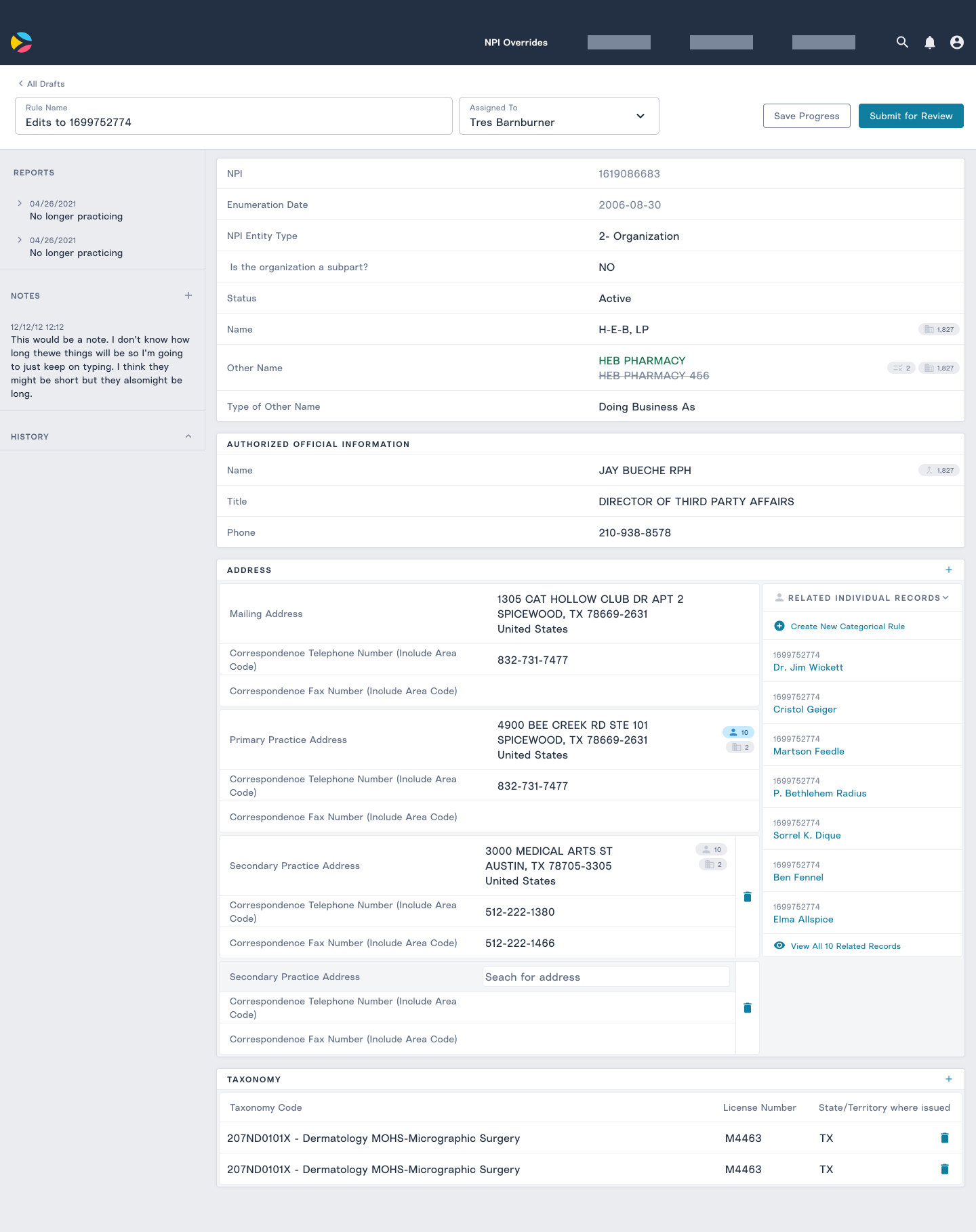
The Point Health team was using the National Provider Identifier (NPI) database for providing results for searches for providers and facilities but we were finding lots of errors in the data. We were seeing:
- Providers listed that are no longer practicing
- Facility addresses that were down the street
- Facilities listing services that they didn't preform
- Inconsistent naming
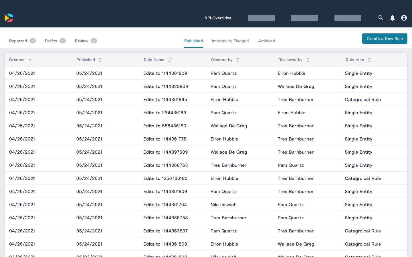
Our team wanted a non-technical way for our Project Managers, Advocates, and potentially providers themselves to update information on an NPI number. We wanted our database to be as accurate as possible so that we weren't misleading users to practitioners or facilities that had false information.
Quick research
One early assumption that the team had was that we would be able to collect user data issues. When people arrived at a provider or facility in the app with inaccurate data, they suggested a change.
To test this out I interviewed several people who had made corrections on other major applications. These people had identified errors in places like Google Maps, Yelp, Wikipedia. We walked through how they made submitted a suggestion and what they were feeling along the way during the interview.
We learned that the driving force behind their contributions was altruism, they wanted to make the system better for the next person. Many of the people contributing to corrections didn't know if the suggestions they submitted got accepted. The good feelings all came from the moment they decided to help the community. We decided that for the first version, we would cater issues to just our team. With the interviews in mind, we thought that building enough of a community feeling around the medical data would take a large amount of effort.
Project kickoff and remote whiteboarding
Once the problem was sufficiently shaped, our team collectively defined the problem and collaboratively designed storyboard user flow. I facilitated a couple of quick design thinking exercises to get the team aligned on the issues we would solve with the first version of the application and what we envisioned the flow.
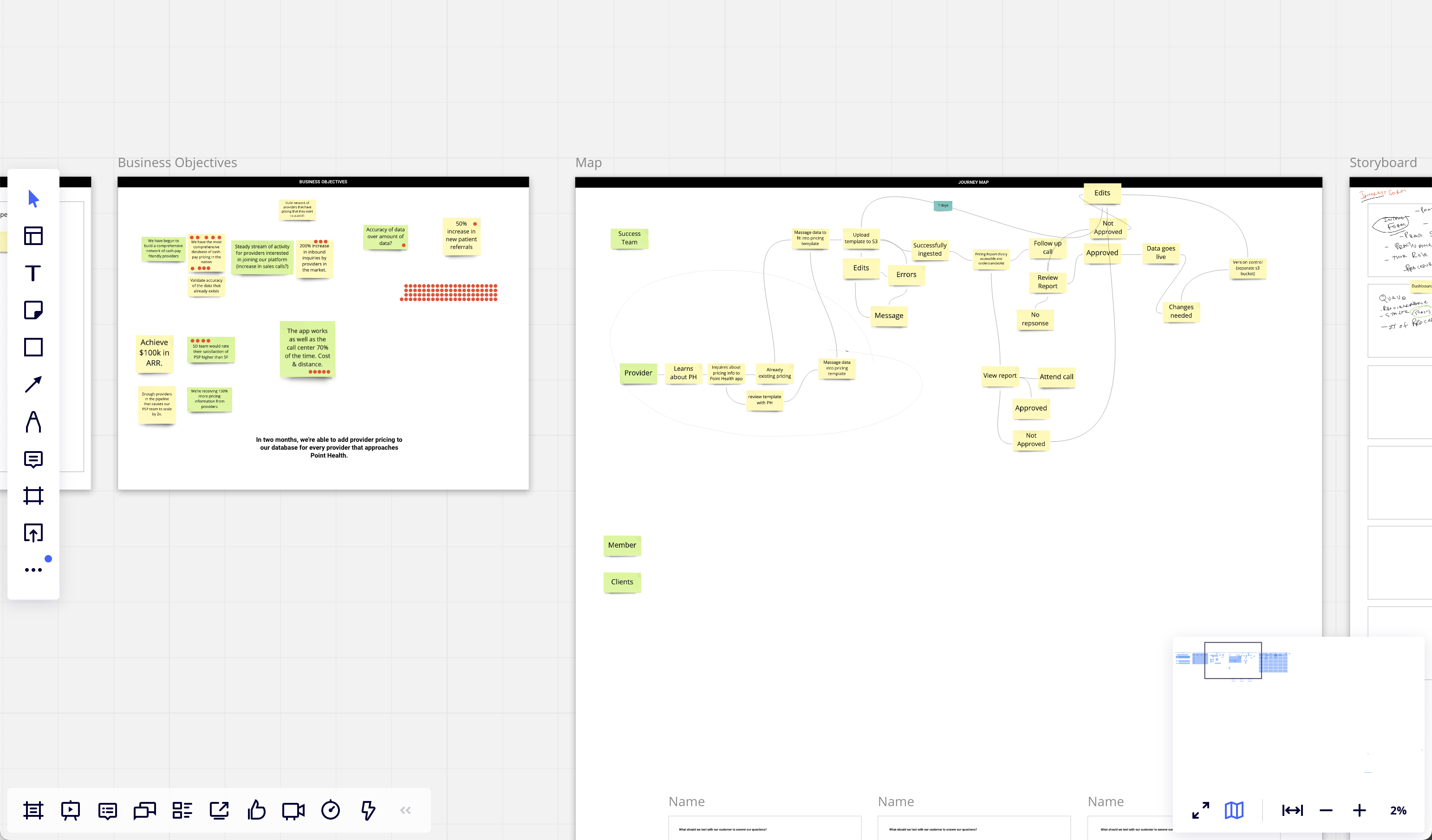
Rough prototype to build an understanding of the problems
I quickly put the storyboard in Figma prototype so that the team could click through the flow that we had made in the kickoff. The prototype allowed us to communicate the intent to the larger group and primary stakeholders.
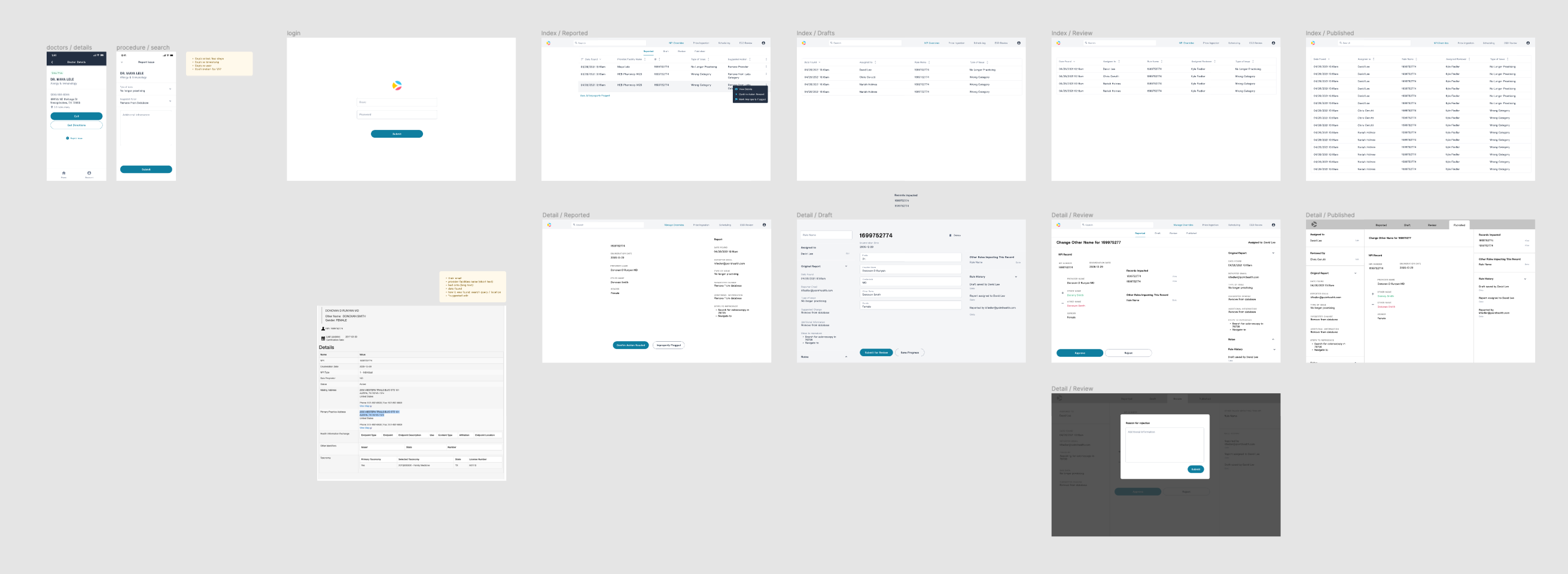
Refine prototype around two core features
With a green light to move forward, I refined the design and honed in on some core use cases. I was in constant communication with our developers, building my understanding of the NPI data model and with our project managers in ways that they would like to manipulate that data. The prototype was a launching point to talk about different issues that we've already found in the data. After those conversations, I started to put issues into two core use cases:
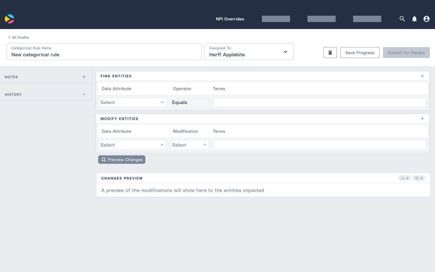
- One-off changes to one NPI number
- Wide sweeping changes to multiple connected NPI numbers
Many of the prototype's features leading up to this insight solved for the one-off changes and didn't consider the more powerful features that could happen with the wide-sweeping changes.